
ITC Benguiat
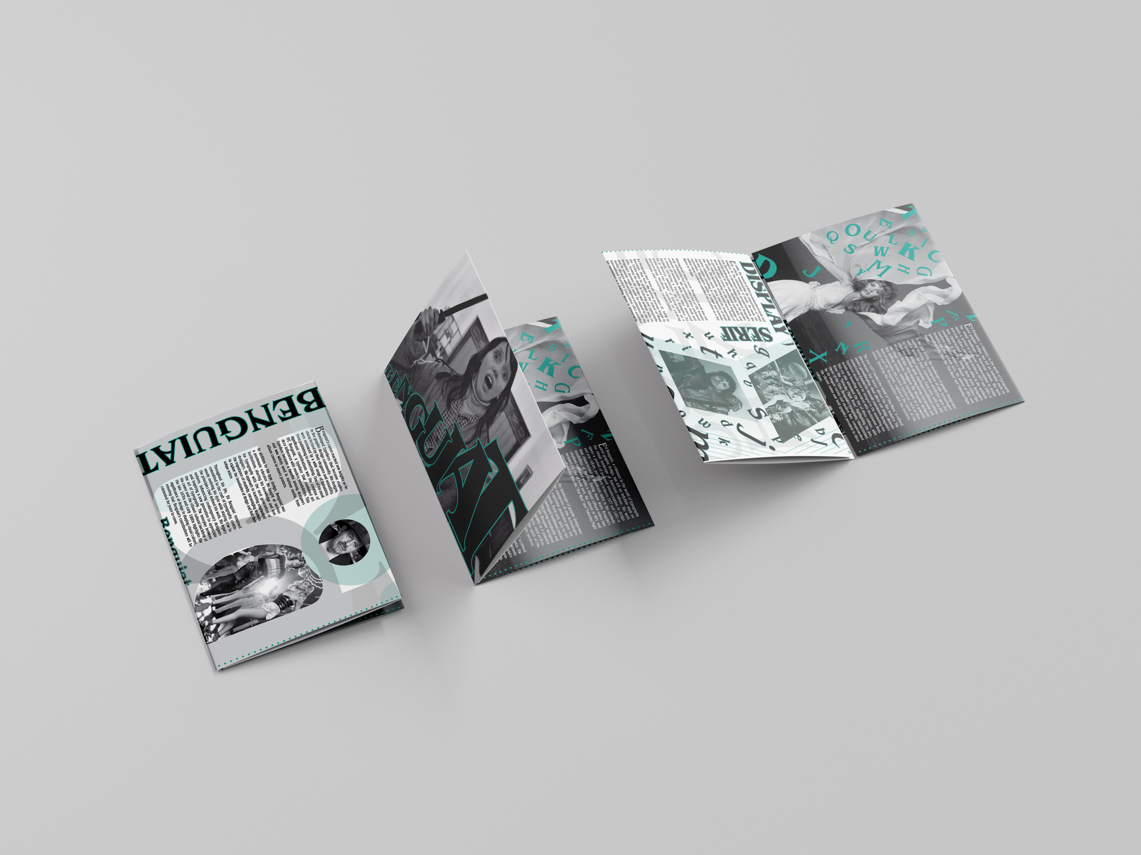
This editorial design project explores the history and influence of ITC Benguiat and its creator, Ed Benguiat. The assignment required researching a typeface and designing an eight-page publication that combined editorial layout, typography and historical research. My goal was to create a publication that reflected the visual style of the late 1970s and early 1980s while showing how ITC Benguiat became one of the defining typefaces of the era.
Concept
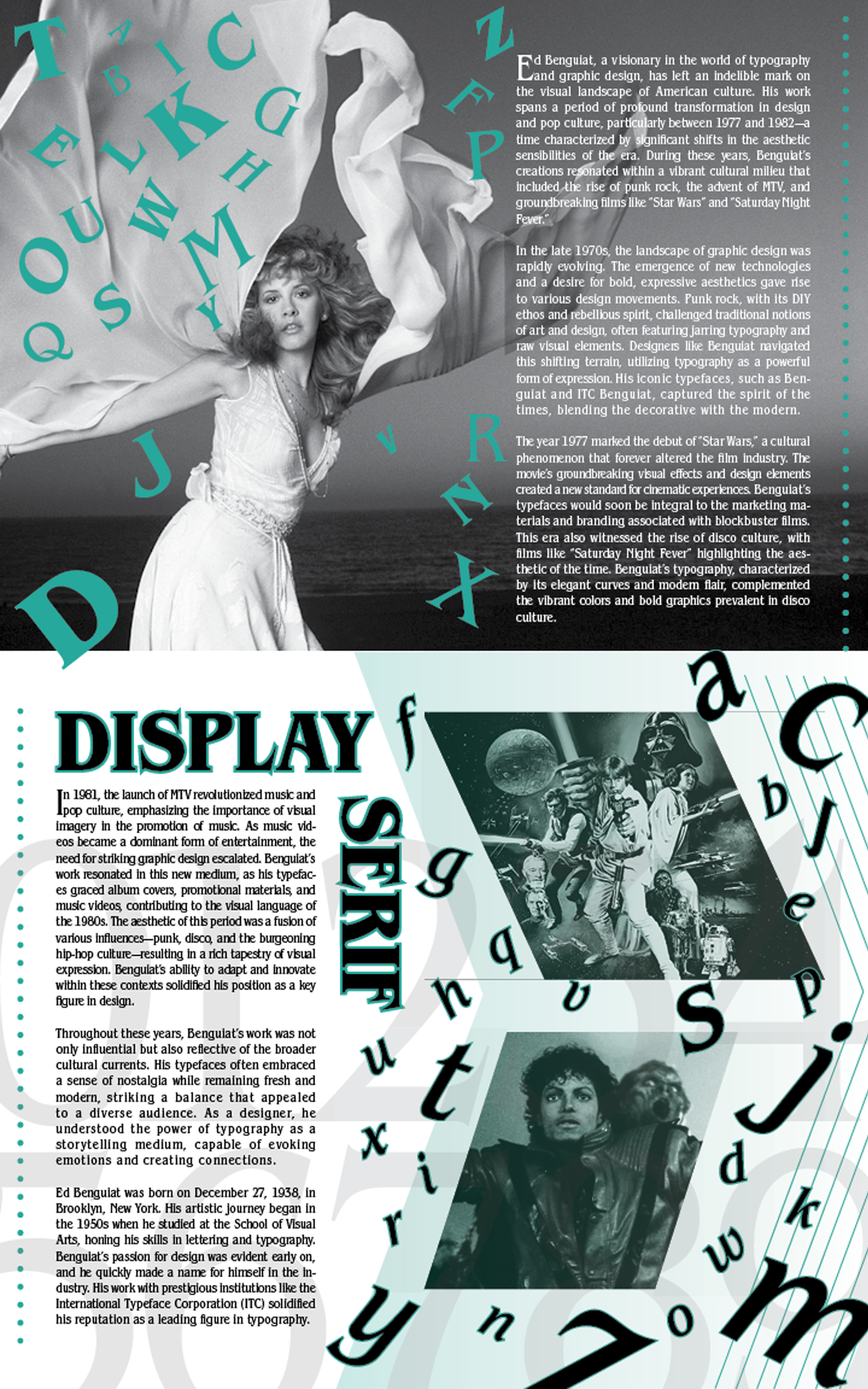
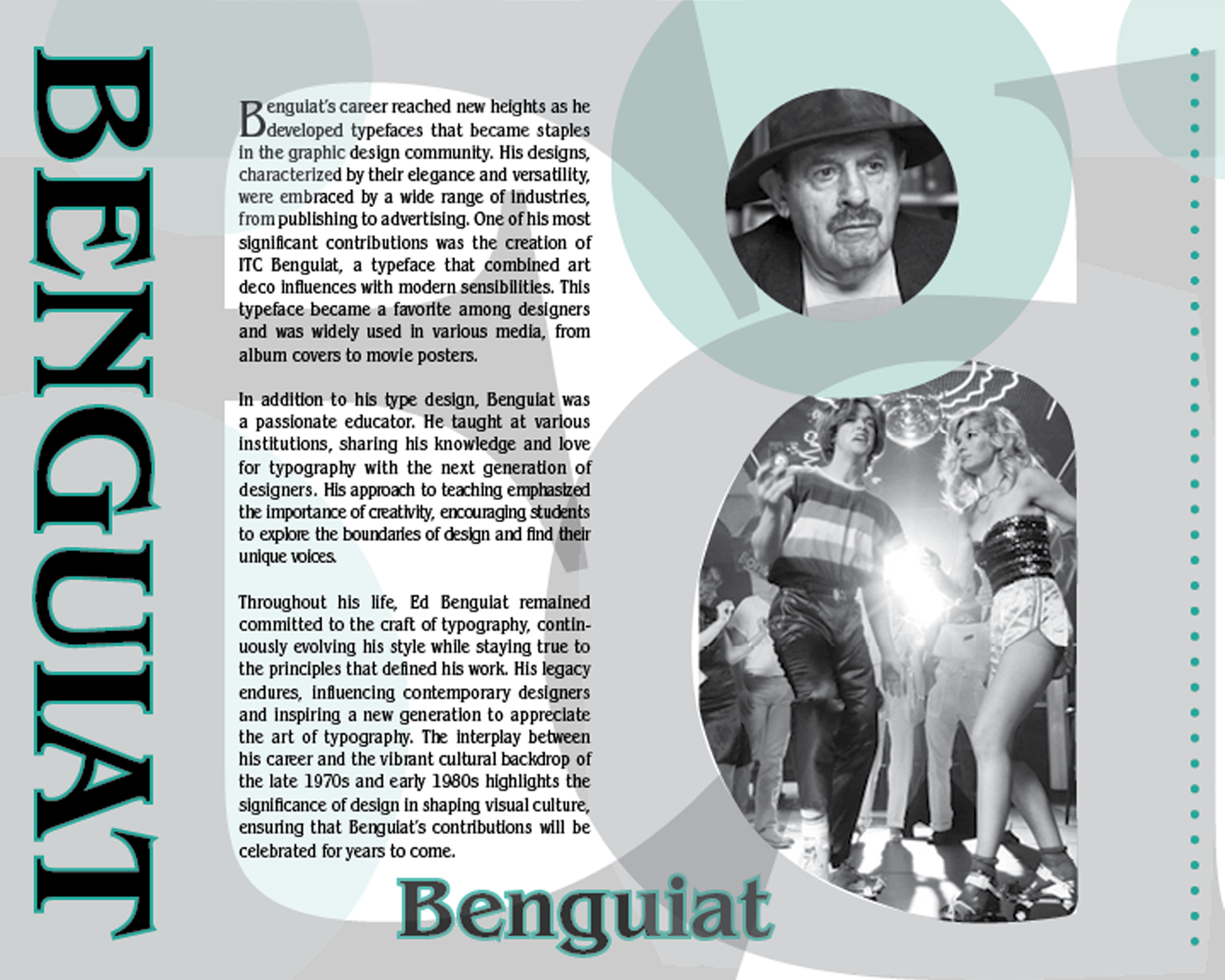
My research focused on the shift from modernism to postmodernism and how designers began using typography as a form of creative expression. ITC Benguiat appeared throughout advertising, magazines and entertainment during this period, becoming closely associated with the visual culture of the time. To support that idea, I designed the publication using expressive typography, period inspired imagery and a mint green color palette based on the dominant Pantone color of 1982. These design choices helped create the feeling of the era while keeping the typeface at the center of the publication.
Process
The publication was designed in Adobe InDesign with supporting images edited in Adobe Photoshop. The assignment required an eight-page layout, two images on each interior spread, a complete character set of the typeface and a specific word count. I used a consistent grid system and clear typographic hierarchy to organize the content while giving each spread its own visual identity. Throughout the publication, typography serves as both the subject and the primary design element.
Tools
Adobe InDesign · Adobe Photoshop · Editorial Design · Typography Publication Layout · Grid Systems · Information Hierarchy · Print Design ·